
 |
| With this one the composition is a bit off, i should move the closest character a little bit to the right so hat his face is in with the line and i should move the furthest character more to the right allowing more space in the middle and better composition. Could use a high angle on this |

With this one i just need to move the background characters more to the left for better composition
 |
| I should move him more to the right to give him some head room/eye room |


 |
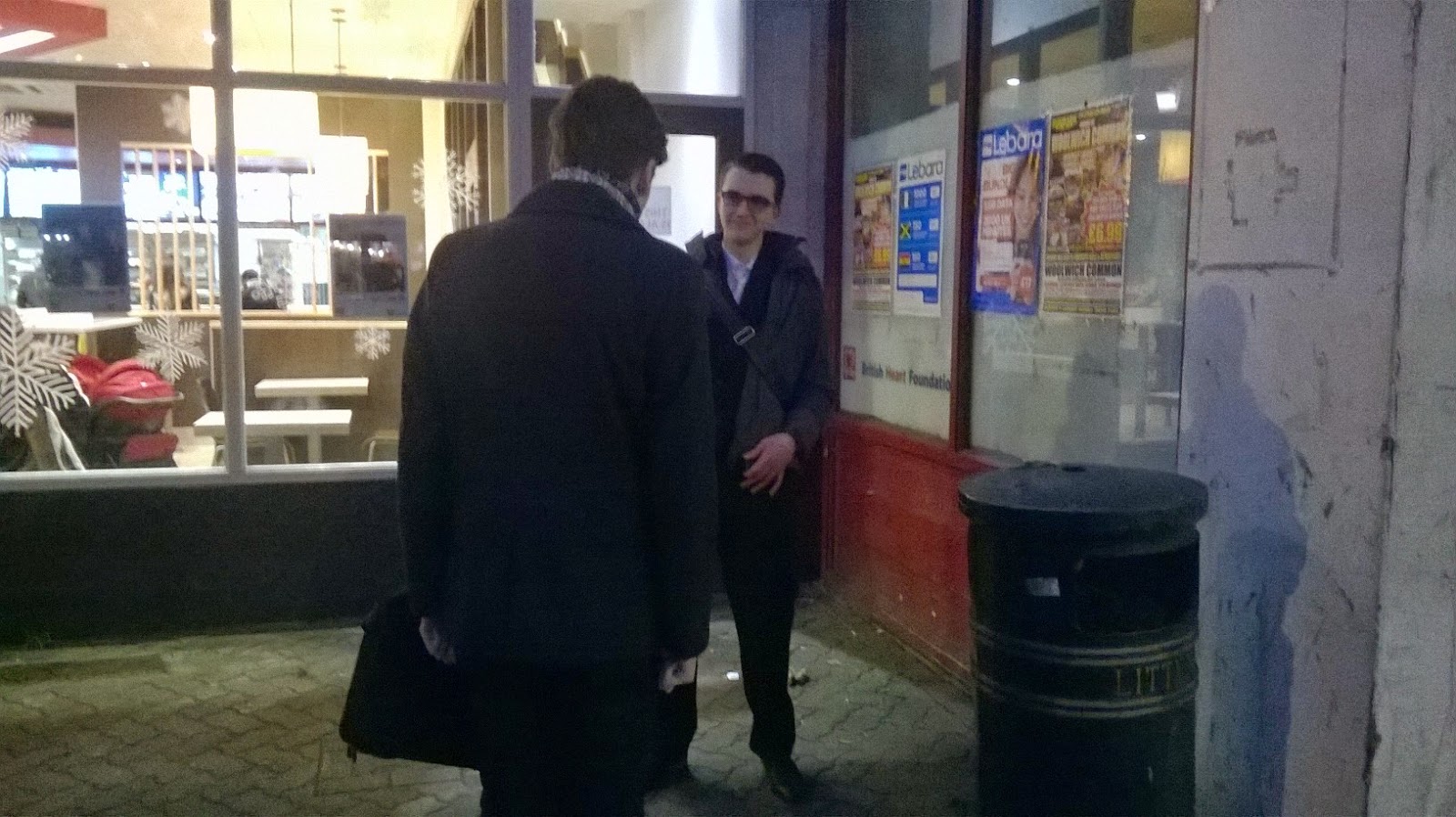
| The furthest character should be move to the other side to allow space in the middle and for better composition also use a low angle to show they have more power in this situation |
 |
| I should of framed this more to the left for better composition and to make it fell like there is motion |
 |
| Use a higher angle to show vulnerability |
 |
| This one is framed too much in the middle so if i move it to the left the the composition would be better |
 |
| Same problem with this one if i move it to the left the composition would be better |

 |
| I need to move this more to the left so there is more leg room and better composition |

 |
| Should move the character furthest away more to the right to make the composition better |


 |
| Should of moved character more to the right for better composition |

 |
| Should frame this more to the left for better composition and to apply with the 180 degree rule |
 |
| I should use a higher angle to show that the character is situation he cannot handle and his vulnerable |


 |
| Should frame this more to the left for better composition |

 |
| Should move the frame more to the left to make look more professional and have better composition |
No comments:
Post a Comment